

The Magic of Colour

Something got me thinking about colour. Maybe it began with our garden, where the daffodils we planted, and the (freelance) celandines are really starting to show, along with just a few primroses so far. All of which can be called 'yellow', yet all are different and the daffs are clearly bi-coloured.

I acquired my first camera half a century ago, and I earned a chunk of my living from photography for more than 30 years; for maybe 20 of them the share was over fifty percent. I’ve done plenty of black-and-white work, and Ansel Adams was an early inspiration, but in general I’ve always preferred colour.
As a photographer, if you’re taking it seriously, you need to know about colour. I started long before digital photography was even dreamed of, except by a few crazy researchers, so I learned how different films 'saw' colour. I even imitated the magazine tests and shot the same scene on both Kodachrome and Fujichrome Velvia. The results were strikingly different. (For the record, I was a confirmed Velvia user almost from the day it was launched.)

Monte Paterno (Paternkofel), Dolomites, Italy. You may find this image vaguely familiar…
And then along came digital. I wasn’t an early early adopter, but I got my first digital SLR in 2004, and I’d been scanning slides and using Photoshop for some years before that. Enter a whole new learning curve, including a new way of talking about colour. Consider the screenshot below.

That secondary menu shows multiple different colour models, but the two I had to deal with were RGB and CMYK. I’m trying to keep this really simple, because you didn’t come here looking for a primer on colour theory, so here’s the Playschool version (through the round window…).
RGB is what most digital devices use, CMYK is the basis of most colour printing. RGB stands for Red, Green, Blue; CMYK stands for Cyan, Magenta, Yellow, Key. Before you ask, 'Key' is printspeak for Black.
Further down, you’ll see options for 8-bit, 16-bit, and 32-bit colour. You probably know that bits (binary digits) are the basic unit of all digital information. Each bit is either a one or a zero, so 8 bits can line up in any of 256 possible combinations.
Therefore an 8-bit RGB image, like the vast majority of digital images you’ll see, has 256 possible values for each of its three colour channels, from 0:0:0 (black) to 255:255:255 (white). The total number of permutations, and therefore the total number of colours that can be encoded, is 256x256x256, or over 16.7 million. And that’s just an 8-bit image; remember there are 16-bit and 32-bit options too.
16.7 million colours…
But how many colours can our eyes distinguish? And here’s a really tricky question: how many colours are there in nature? The honest answer to that is I don’t know. Some philosophers say that colour doesn’t exist in nature, it’s purely a perceptual phenomenon. What we call 'colour' in nature is really our response to the wavelength of light—or the energy states of the photons hitting our retinas.
The only safe answer to both questions is: a lot. And the answer to the first question will vary from individual to individual; just as some people can distinguish incredibly subtle differences between scents, and thereby earn large salaries as perfumiers or wine-tasters, while others (like me) struggle to distinguish oregano from marjoram.
Still, most people can distinguish a ton of colours, probably millions. And yet we see a rainbow and tend to describe it in the familiar ROYGBIV terms. Just seven colours (eight in Discworld, of course: yes, the nod to Terry Pratchett in the title of this piece is entirely intentional).
Perhaps you can see where this is going…
But first, one more bit of colour theory. We know that the electromagnetic spectrum extends both ways from the visible-to-us band, to infra-red and ultra-violet and far beyond. The spectrum is normally, and logically, depicted in linear form, just as it appears in a rainbow or when you pass white light through a prism.
And yet anyone who studies art, and many who study photography, encounters the colour wheel. This is directly related to the way we generally perceive colour. Red and violet sit adjacent, not at opposite ends of the spectrum, and we see blue and orange, for example, as complementary
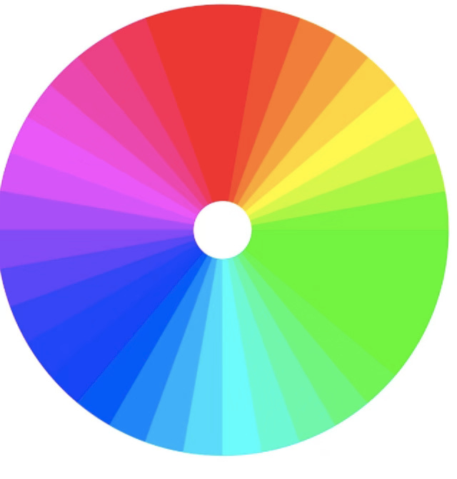
Image by PAIGEROXM8 Creative Commons Attribution-Share Alike 4.0
Also, by the way, even 'black and white' images aren’t (mostly) just black and white. Refer back to that Photoshop menu: there is no 'black and white' option; it’s called 'grayscale'.
If I’ve done my job, you’ve probably guessed by now that all this has relevance to the way I think about skin colour. I don’t think I need to labour the point, so let me just finish—aiming to get there in under 1000 words—with two quick observations on how this (I think) informs my writing in the Shattered Moon series.
One, skin colour doesn’t carry the significance it does (mostly regrettably) in our world; there are other fracture lines. Therefore I can’t use shorthand like 'Black', or say that they look 'Asian' (which tends to mean something different in the UK and the US anyway. But I do want to give a clear sense that it’s a diverse population, so I’m always on the lookout for evocative words. (For which, by the way, one of the best resources I’ve found is Writing With Color.)
Two, more generally, I’m trying to be precise when mentioning colours in general. But I’d rather say the sky was blue than use a word like 'cerulean', which doesn’t give me a clear image of a specific colour—and I would bet it’s the same for at least 80% of readers. There are lots of resources for this too. And maybe this is part of what inspired one reviewer of Three Kinds of North (Norman Hadley) to say this: "Jon is a photographer by background and this shines through in the prose as an intense watchfulness."
I love colors. I love even more the connection you drew between your trip to the Dolomites and the color wheel. What continues to amaze me is how often I 'discover' new colors. It almost seems like there's no math to it, but maybe there is?
Interesting article thanks